.png)


6 Ways Power BI Helps Dig Deeper into Your Visuals & Data
Power BI truly offers some impressive features and even today, I see many end users amazed by capabilities that have been available since day one. In this blog, we’ll explore the various ways Power BI can help us dig deeper into our Power BI visuals. I’ll also provide an example for each method so you can see it in action.
1. Drill-Up and Drill-Down Features
The first feature we’ll explore is drill-down. If you’re a seasoned Power BI professional, you might be thinking, “This is old news.” While it may be an expected feature, I still receive questions about it, so it deserves a spot on our list as a key way to dig deeper into your visuals.
Drill-down or drill-up lets end users start at a top-level hierarchy, such as Region, then drill down to Store. Alternatively, you could begin at Year and drill down to Month or even Day. You know you can drill down or up when arrows appear in the top-right corner of a visual as you hover over it.
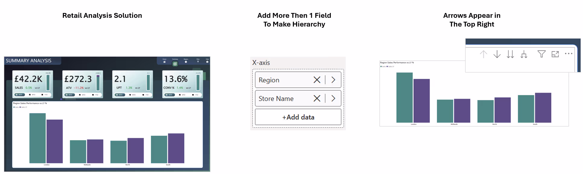
To see this in action, we will first see explore the Drill Mode option. We can enable drill mode by selecting the button as displayed below:
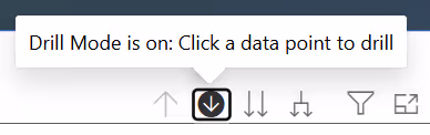
Once Drill Mode is on, selecting elements in your visual will automatically drill down one level. Note that by default, selecting a visual element triggers cross-filtering and highlighting, which we’ll discuss later in this blog.
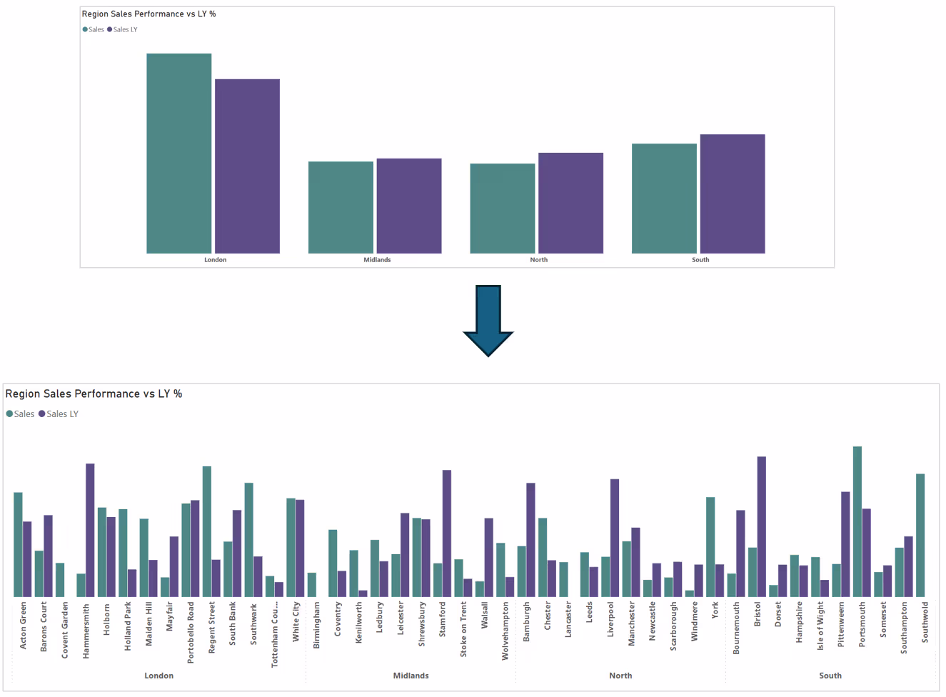
For instance, in the example below, when Drill Mode is enabled and I select any column representing “London,” Power BI instantly drills down to the Store level, but only shows stores located in London.
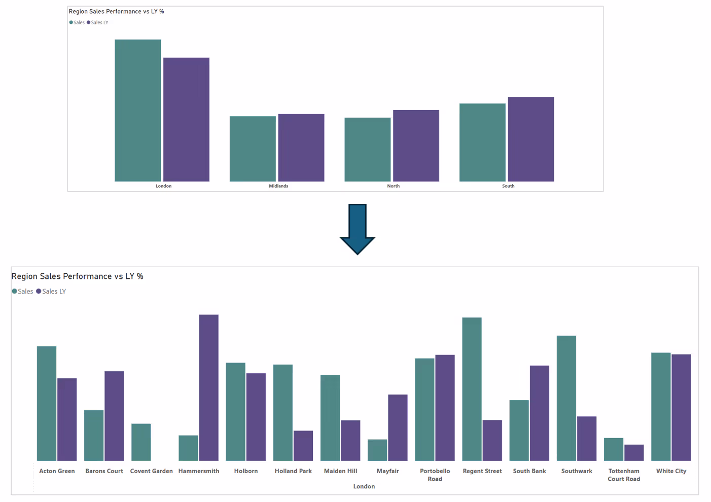
Another option is “Go to the next level in the hierarchy”. Selecting this instantly drills down to the store level. The Region level no longer appears on the X-axis, so you see all stores displayed.

As shown below, once you choose “Go to the next level in the hierarchy” the report simply displays all stores.
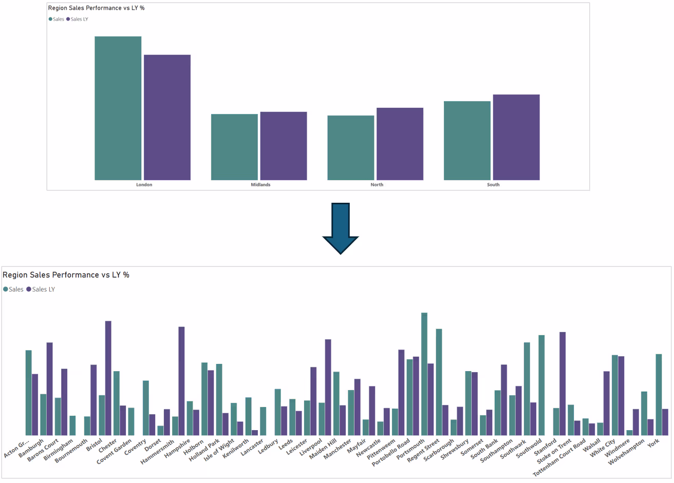
The next option we have is "Expand all down one level on the hierarchy". I find this is more common when I analyse data.

It displays all stores as before, but categorises them by their respective region. That’s a handy way to see more context!
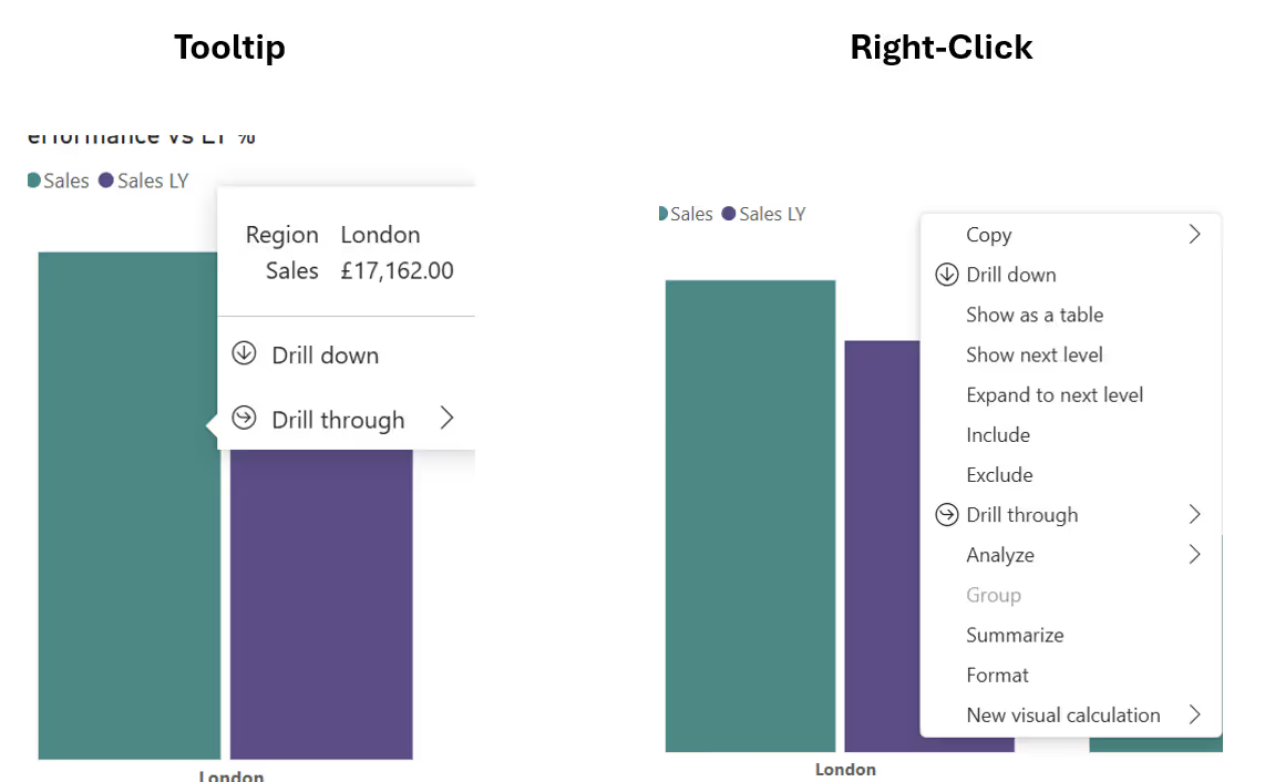
To wrap up this section, there are a few more methods to drill down and drill up. You can hover over a visual element, such as a column, and see the drill-down option appear (ignore Drill Through for now - we will explore that later). You can also right-click a column and choose “Drill down” again from the context menu.
2. Drill Through Capability
We’ve seen how drill-down and drill-up can help us dig deeper into Power BI visuals. Now, let’s explore a feature called Drill Through. I absolutely love this! When used in the right scenario, it adds so much value to your analysis.
It’s worth noting that many people mix up Drill-Down/Up with Drill Through, but they’re not the same thing. So, what is Drill Through, and how does it differ from Drill-Down/Up? As you’ve seen, drill-down works on a single visual and lets you move up or down an implicit or explicit hierarchy, basically multiple fields within one visual.
Drill Through, on the other hand, enables end users to “drill through” to a different page, so moving from a source page to a target page for further, more detailed analysis. Let’s look at an example to make this clearer.
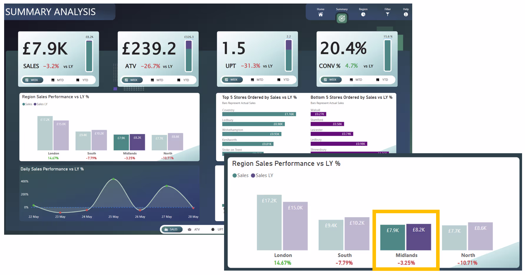
Below, we have our beautiful and highly insightful Retail Analysis report. This summary page is designed for regional managers. Side note, if you want to see this solution in action, check out the video: Power BI Retail Dashboard.
%20(2280%20x%201720%20px)%20(1).png)
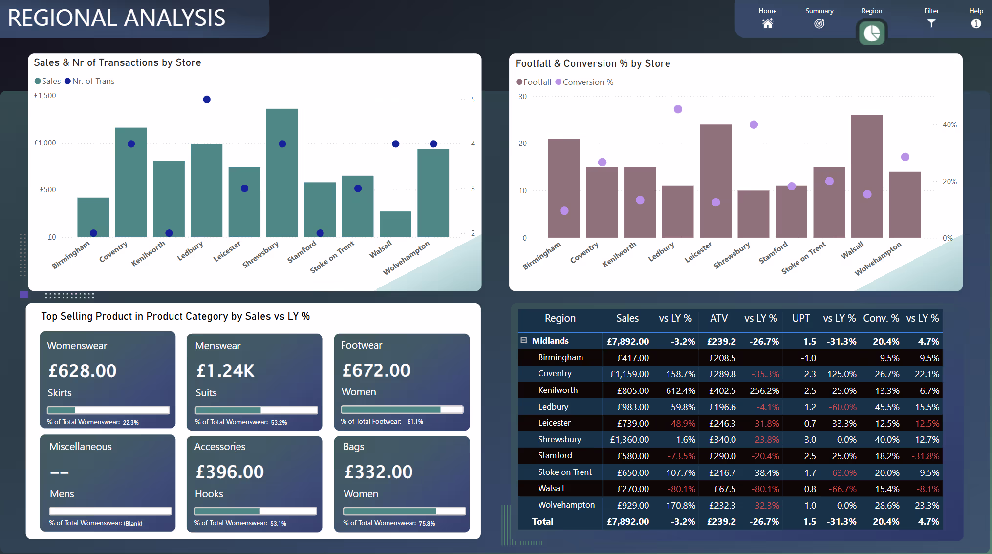
Now, Regional Managers typically start on a summary analysis page for a high-level overview of weekly performance, plus a snapshot of how their region compares to others. A bit of healthy competition is always good! However, sometimes they need a more detailed view of their specific region. For example, if I’m the Regional Manager of the Midlands, I want to see how only my stores are doing. I need a dedicated page just for that.
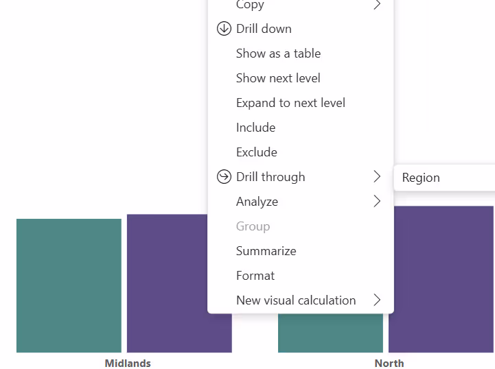
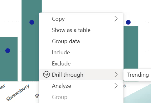
This is where Drill Through shines. Let’s see it in action… I’ll right-click on the Midlands column, select “Drill through” and notice there’s a page called “Region.” You can think of it as the destination or target page for more in-depth analysis.
Once I select it, Power BI automatically takes me to the Regional Analysis view and keeps all the filters from the previous page (if it’s been configured to do so). How great is that? In this scenario, a regional manager can start at a summary level, spot any issues, like a red KPI, and then drill deeper into the details. With Drill Through, it’s all just a click away!
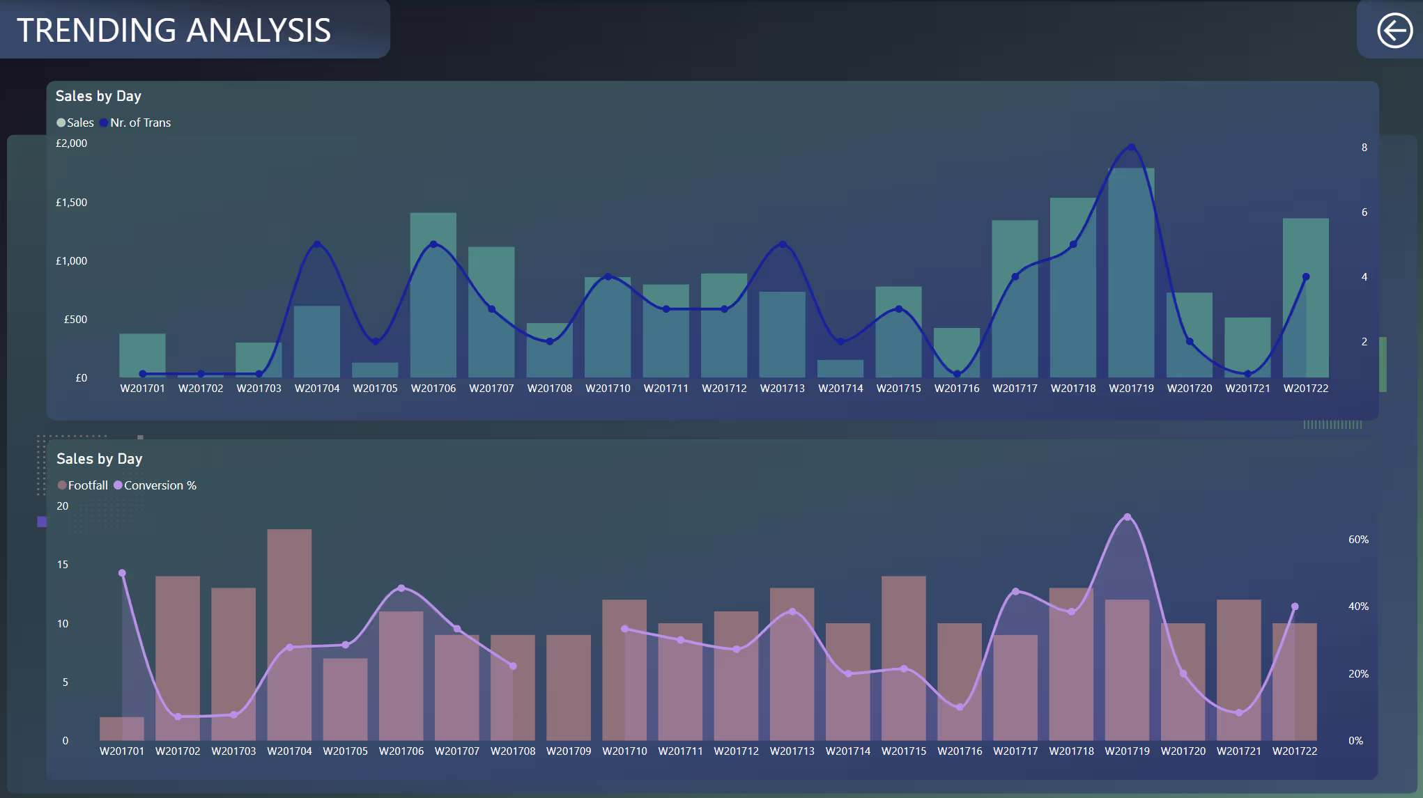
But it doesn’t stop there. Let’s say they find one of their stores isn’t performing well. Maybe they want to figure out if this is a one-off for the selected week or if it’s a continuous trend that needs deeper investigation. In that case, they can right-click on the “Shrewsbury” store, choose “Drill through” and land on a new destination page called “Trending”.
I’ve now drilled through to the “Trending Analysis” view. Here, I can see performance data specifically for this store once I’ve drilled through from it.
From the examples above, it’s clear how Drill Through helps us dig deeper into Power BI for data analysis. Of course, this is just a high-level overview, there’s so much more you can do. For instance, you can drill through to an entirely different report instead of just another page or even use a button instead of right-clicking to trigger the drill through.
3. Cross Filtering and Cross Highlighting
We now move on to cross-filtering and cross-highlighting, a clear winner for showcasing how Power BI enables deeper insight into visuals. This feature has been part of Power BI since its early days, and I still see many users get excited when it’s used well. Essentially, it allows a single visual to act as a filter for all other elements on the canvas. Think of every dashboard / report visual as being interconnected, where interaction on one visual can instantly filter or highlight others. Let’s look at some examples to see this in action.
Below, I selected the columns for "Midlands" and all the other columns have turned transparent or greyed out. This visual cue indicates that cross-highlighting or filtering is in action. Essentially, the entire report page is now filtered exclusively for Midlands. Imagine you're a Midlands manager, you see the total performance for all the core KPIs above as a default view, but if you want a quick glance at only your region's performance, just select "Midlands" and bam! The entire solution instantly filters to your selection. A lot of this is cross-filtering.
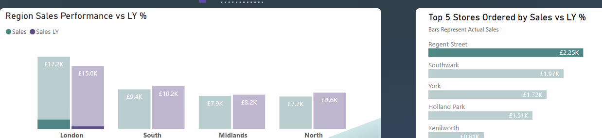
Now, let’s explore cross-highlighting with the example below. It might not be the most insightful scenario, but it’ll help you see how this feature can help you dig deeper into your visuals. Notice that when I select the top-performing store from the “Top 5 Stores” visual… “Regent Street”… all the other horizontal columns turn grey, indicating that cross-filtering/highlighting is focusing solely on “Regent Street.”
However, take a look at the “Region Sales Performance” clustered column chart. It doesn’t fully filter the visual as if it did, we’d only see the single region of London (since Regent Street is located there). Instead, it highlights just the portion of London’s data that specifically relates to Regent Street. Hopefully you can see now how powerful this feature can be for more nuanced analysis and business insights.
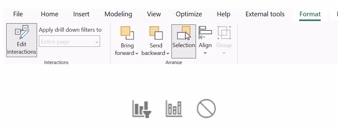
To wrap this up, I’d like to show you how to control which visuals are affected by cross-filtering and cross-highlighting and the way to change how visuals interact with each other (cross-filter, cross-highlight or none). First, select the “source visual”. In the ribbon, go to Format and then choose Edit Interactions. Once you do this and keep that visual selected, you’ll see three buttons appear on top of the other visuals (sometimes only two if it’s a Card visual). These buttons let you decide how each visual should respond to interactions from the source visual.
4. Analyse Feature and Benefit of Using It
Next up is a feature that enables us to dig deeper into visuals which is called the Analyse feature. This capability enables us to quickly understand fluctuations in our data, providing automated insights directly within Power BI. When looking at visuals, we often encounter scenarios like sharp drops or notable increases and naturally wonder, "Why did this happen?". With the Analyse feature, you can right-click on a specific data point and select options such as:
- Explain the increase
- Explain the decrease
- Find where this distribution is different
Power BI then runs built-in machine learning algorithms over the data, rapidly generating insights to clarify these fluctuations. To make more sense of this, lets explore some examples below.
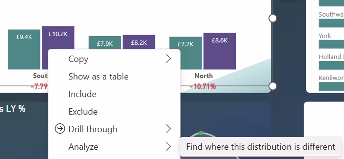
Find where this distribution is different
For the first example, I have right-clicked the "South" region from the Region Sales Performance visual and selected "Find where this distribution is different".
Immediately, Power BI provides us with detailed insights showing the factors most influencing the sales distribution differences across regions. Notice that it automatically identifies key product subcategories like "Kids", "Casual Shirts" and "Suits" and categories such as "Menswear" and "Womenswear", which show the most significant differences.
Kids products significantly drive higher sales in the South compared to other regions.

Menswear and Womenswear categories also show notable differences across regions.
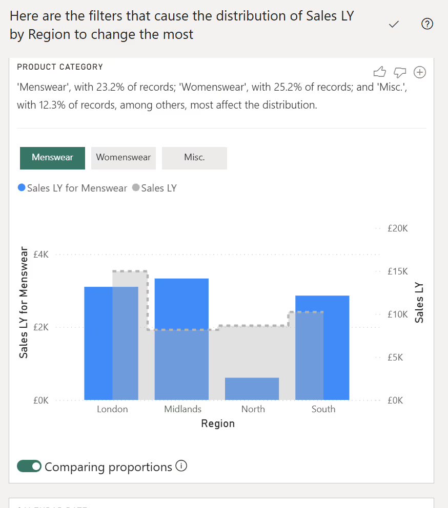
This automated analysis highlights exactly which product groups are influencing the unique distribution of sales in the South region compared to others.
Explain the Decrease
One additional example, I have a line chart called Daily Sales Performance vs LY %. I noticed a clear downward trend between two dates. To investigate further, I right-clicked the downward data point and chose "Explain the decrease."
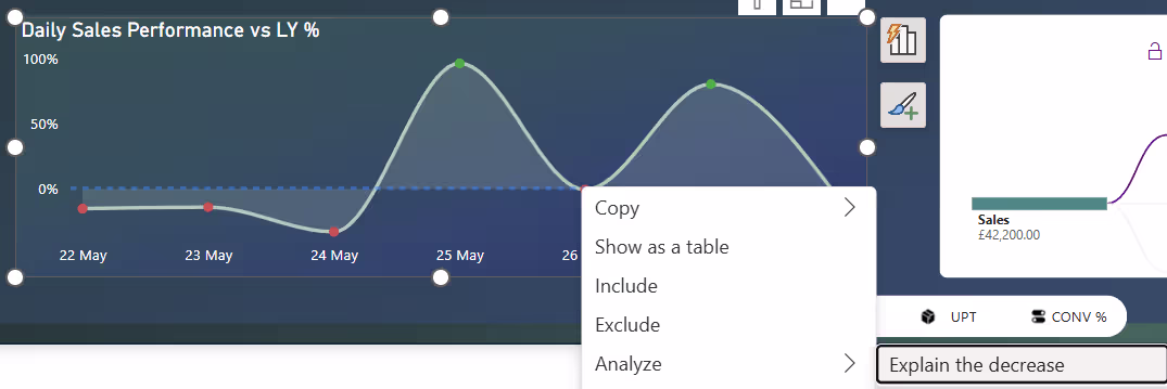
Power BI instantly provided insights, identifying product categories such as "Womenswear," "Accessories," and "Bags" as major contributors to the sales drop between these dates. It visualised this clearly, showing which product groups significantly impacted performance and provided a graph like a scatter plot highlighting how each category contributed to the decrease.
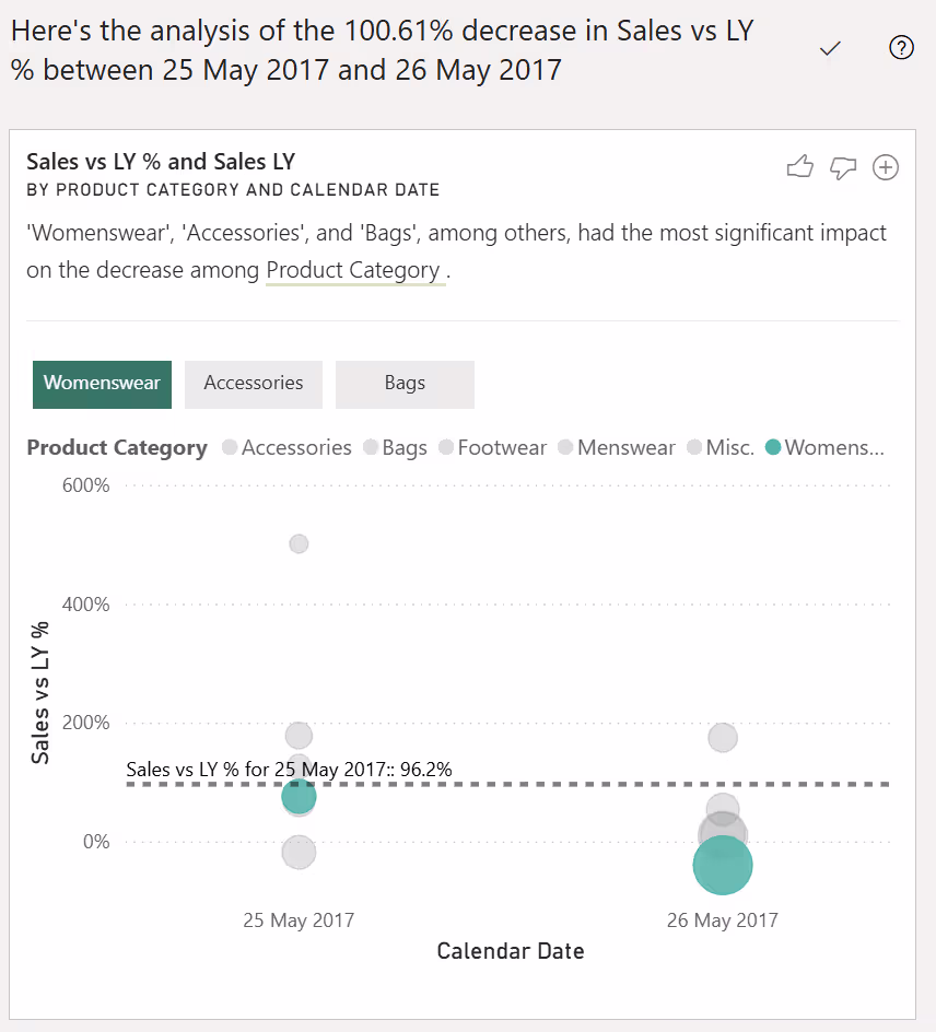
These examples clearly showcase how the Analyse feature helps users rapidly pinpoint the reasons behind data fluctuations without manually slicing or drilling through multiple reports. It empowers you to go from "What happened?" to "Why did it happen?" with just a few clicks, enabling swift, informed decisions based on deeper visual analysis. However, please do keep in mind that these should be used carefully and that not all end-users would be able to grasp some of the visuals displayed in the above analysis.
5. Smart Narrative Feature in Power BI
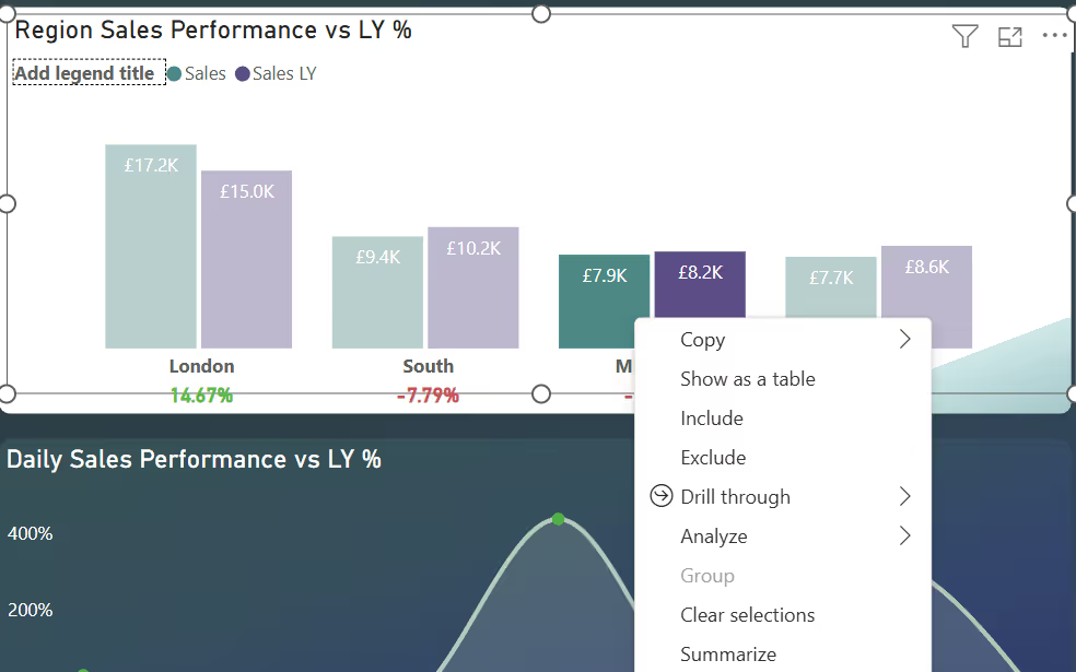
Another great way Power BI helps us dig deeper into visuals is through the Smart Narrative feature. This feature provides a quick text-based summary of visuals, giving insights that help you quickly grasp key points and trends within your database. You can easily use this feature by right-clicking on a visual and selecting the "Summarize" option.
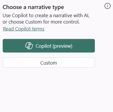
After clicking, a text box appears, offering two options: "Copilot (preview)" and "Custom". Currently, the Copilot option is only available if you're running on a high-end Fabric Capacity (F64 and above)… frustrating, I know! So for our example we'll select the "Custom" option. By the way, if you want to see the Narrative Visual with Copilot in action check out my blog: Enhancing Power BI with the New Narrative Visual and Copilot Integration
Power BI instantly generates a narrative summarising the key insights from this visual:
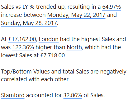
The generated text summary clearly outlines:
- Overall Trend: Sales vs Last Year (LY) has trended upwards, showing a 64.97% increase between specific dates (Monday, May 22, 2017, and Sunday, May 28, 2017).
- Best/Worst Performers: Clearly identifies London as the highest-performing region, with sales significantly (122.36%) higher than the lowest-performing region (North).
- Insightful Details: It highlights specific stores such as Stamford, accounting for a notable portion (32.86%) of total sales.
- Correlations: It also reveals insights like top/bottom values negatively correlating with total sales, providing depth to your analysis.
From the above, it should be clear how Power BI offers another way for end-usrs to easily dig deeper into visuals by simply selecting the "summarise option.
6. Get Insights Feature
Another effective way Power BI helps dig deeper into visuals is the "Get Insights" feature. This is available in the Power BI Service and this feature uses machine learning to highlight important patterns automatically, such as anomalies, trends and KPI analysis.
To use it, select the ellipsis (...) on your report in the Power BI Service and choose "Get insights".
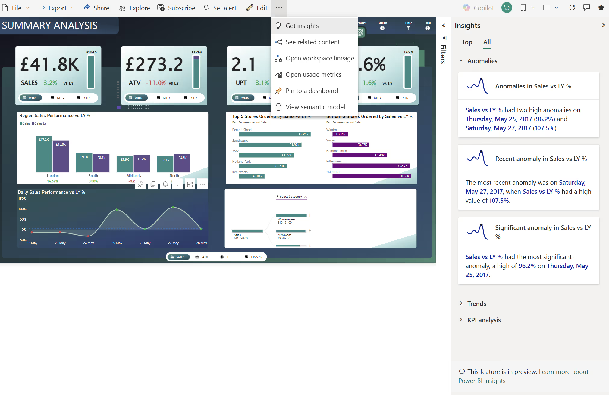
Note that this feature is currently in preview. In the screenshots above, after selecting "Get insights", Power BI immediately provided insights such as:
- Anomalies: Unusual spikes or dips detected in the Sales vs LY % visual, pinpointing specific dates.
- Trends: Recent increases or decreases in performance over the selected time period.
- KPI Analysis: Insights highlighting significant deviations against set targets.
Each insight offers quick visual cues and explanations, allowing you to quickly identify and act on key information hidden within your data, without manual analysis. This feature is powerful for quickly uncovering hidden insights and enhancing your analytical functionality, letting you move from simply viewing your data to deeply understanding it.
Even More Ways to Dig Deeper into Your Power BI Visual Analysis
Okay, we've explored 6 ways Power BI helps us dig deeper into visual analysis. However, there's still soo much more to explore! I'll briefly highlight a few additional features below, each deserving a closer look. Be sure to explore these yourselves to truly appreciate how much more Power BI can enrich your data visualisation and reporting experience.
- AI-Influenced Visuals: Decomposition Tree
- Quickly visualise and drill into your data across multiple dimensions interactively, uncovering hidden drivers behind metrics in your data.
- AI-Influenced Visuals: Key Influencers Visual
- Instantly discover which factors significantly influence your KPIs, making it easy to pinpoint and understand impactful drivers behind your data changes.
- Copilot (Narrative Visual with Copilot)
- Leverage the power of AI to automatically create insightful narratives around your data. For an in-depth exploration, check out our existing blog on this topic: Exploring the Narrative Visual with Copilot.
- Anomaly Detection (Line Chart Visual)
- Automatically detect anomalies such as unexpected spikes or dips in your time-series data within line charts. Highlight significant deviations quickly and intuitively, enabling rapid responses to unusual data changes.
These are just more ways Power BI allows users to go deeper, discover hidden patterns, and make faster decisions.
Conclusion
We've now explored various powerful ways Power BI enables deeper insights and more meaningful visual analysis. While there are many additional features we could discuss, the examples provided clearly demonstrate the significant benefits Power BI can bring to your organisation in enhancing your analytical capabilities.
Ready to Get More from Power BI?
If any of this sounds familiar, we can help! We’re end-to-end Power BI experts, with proven approaches, who know how to get it right.
Book a free call using the link below or click “Discuss my project.”

.avif)
%20(8).png)
.png)